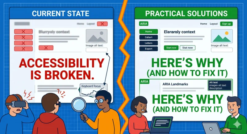
Accessibility Is Still Broken (Here's Why)
The Accessibility Paradox
It is 2026, and we are still failing at the basics. We’ve had WCAG (Web Content Accessibility Guidelines) for decades. Browser support for ARIA (Accessible Rich Internet Applications) is better than ever. We have an explosion of automated testing tools, linters, and “accessible” component libraries. Yet, the annual WebAIM Million report continues to show that over 95% of the top million homepages have detectable WCAG 2 failures.
The paradox is striking: as our tools get “smarter,” our websites often become less usable for people with disabilities. We’ve traded simplicity and semantic clarity for complex abstractions and “developer experience,” often at the direct expense of the end-user. Accessibility isn’t broken because the technology is lacking; it’s broken because our mental models and development workflows treat it as a secondary decoration rather than a foundational requirement.
Accessibility Is Still Broken (Here's Why).
The Automated Testing Illusion
One of the biggest contributors to the current state of the web is the over-reliance on automated tools. Developers run a Lighthouse audit, see a green “100” score, and move on. This is a dangerous delusion.
Automated tools are excellent for catching “low-hanging fruit”—missing alt text, poor color contrast, or missing lang attributes. However, they are fundamentally incapable of evaluating meaning and context. A computer cannot tell you if your navigation flow makes sense to a screen reader user or if a modal dialog traps focus correctly.
| Feature | Automated Testing | Manual/User Testing |
|---|---|---|
| Color Contrast | Excellent (mostly) | Necessary for transparency/gradients |
| Alt Text Presence | Catches missing tags | Verifies if text is actually descriptive |
| Keyboard Navigation | Very Limited | Only way to verify logical tab order |
| Screen Reader Flow | Non-existent | Crucial for UX and context |
| Focus Management | Limited | Essential for SPAs and Modals |
Common Pitfall: The “Green Score” Trap Never assume a 100% Lighthouse score means your site is accessible. It only means you’ve passed the subset of rules that a machine can programmatically verify. You can have a “perfect” score on a site that is completely unusable for a keyboard-only user.
JavaScript’s Accessibility Debt
The rise of Single Page Applications (SPAs) and heavy JavaScript frameworks has introduced a massive “accessibility debt.” While React, Vue, and Svelte have made progress, the default patterns they encourage often lead to broken experiences.
The Focus Management Nightmare
In a traditional multi-page website, a link click triggers a browser reload, and focus naturally moves to the top of the new page. In an SPA, a “route change” is just a DOM update. If you don’t manually manage focus management, the user’s focus remains on the now-non-existent link or jumps back to the body, leaving screen reader users confused and lost.
The Div-Button Anti-Pattern
I see this everywhere: a div or a span with an onClick handler styled to
look like a button. This is the height of technical laziness. A real <button>
gives you keyboard support (Enter/Space), focus states, and the correct role for
free. When you use a div, you have to manually re-implement tabindex,
keyboard listeners, and ARIA roles. You will almost certainly forget
something.
Code Comparison: The Right Way vs. The Lazy Way
<!-- THE LAZY WAY (DO NOT DO THIS) -->
<div class="my-button" onclick="handleSubmit()">Submit</div>
<!-- Issues: No keyboard support, no screen reader role, no focus state -->

<!-- THE "REPAIR" WAY (BETTER, BUT REDUNDANT) -->
<div
  class="my-button"
  role="button"
  tabindex="0"
  onclick="handleSubmit()"
  onkeydown="if(event.key==='Enter'||event.key===' ') handleSubmit()"
>
  Submit
</div>

<!-- THE CORRECT WAY (DO THIS) -->
<button type="button" class="my-button" onclick="handleSubmit()">Submit</button>
<!-- Benefit: 100% accessible by default with zero extra code -->
The “We’ll Fix It Later” Mentality
In many agile environments, accessibility is treated like “polishing”—something to be done in a later sprint that never comes. This approach is technically and financially irresponsible.
Retrofitting accessibility into a completed application is exponentially more expensive than building it in from the start. It’s like trying to add an elevator to a skyscraper after the foundation and frame are already built. If you treat accessibility as a non-functional requirement (like security or performance), you avoid the “accessibility tax” that comes with refactoring broken components.
“Accessibility is not a feature. It is a fundamental property of the web.”
Framework Defaults and the “Shadow DOM”
Many modern component libraries ship with zero-style foundations that claim
to be accessible. While some (like Radix UI or Headless UI) are
excellent, others prioritize visual flexibility over structural integrity. We’ve
seen a disturbing trend of stripping away default focus styles (outline: none)
without providing a high-contrast alternative.
Pro Tip: Debugging with CSS Use a “stress-test” stylesheet during development to highlight common accessibility errors visually. You can add this to your development build to make mistakes impossible to ignore:
/* Highlight images without alt attributes */
img:not([alt]) {
  outline: 5px solid red !important;
}

/* Highlight empty buttons */
button:empty {
  outline: 5px solid orange !important;
}

/* Highlight links with role="button" (use a button instead!) */
a[role="button"] {
  outline: 5px solid purple !important;
}
Mobile Accessibility: The Forgotten Frontier
We often forget that accessibility extends to mobile devices. Small touch
targets, lack of gesture alternatives, and broken zoom behavior are rampant. If
your website disables user-scalable zoom (user-scalable=no), you are
actively harming users with low vision.
Mobile screen readers (VoiceOver on iOS and TalkBack on Android) work differently than their desktop counterparts. Testing on a physical device is the only way to ensure your mobile experience isn’t a frustrating maze of “unlabeled button” announcements.
A Practical Accessibility Audit Checklist
To move beyond the broken state of the web, every developer should follow a manual checklist before merging a PR:
- Keyboard Only: Can I navigate the entire feature using only the
TabandShift+Tabkeys? - Visible Focus: Can I clearly see where the focus is at all times? (No
outline: none!) - Semantic Structure: Is the heading hierarchy logical? (One
h1, no skipping levels). - Form Labels: Does every input have a programmatic label (not just a placeholder)?
- Screen Reader Test: Does the screen reader announce state changes (e.g., “Menu expanded”, “Error: Email is required”)?
- Color Contrast: Do all text and interactive elements meet WCAG 2.1 AA ratios (4.5:1)?
- Zoom: Does the site remain functional at 200% text zoom?
The Business Case (Beyond Ethics)
If “doing the right thing” isn’t enough to convince your stakeholders, use the language of business:
- Market Reach: 15% of the global population has some form of disability. Ignoring them is ignoring a massive market segment.
- SEO: Search engines are effectively “blind” users. Semantic HTML and proper structure help bots index your site more effectively.
- Legal Risk: Accessibility lawsuits are at an all-time high. Compliance is cheaper than litigation.
- Maintenance: Accessible code (semantic HTML) is generally cleaner, easier to test, and more maintainable.
Conclusion
The web is fundamentally designed to be accessible. We break it by being clever. To fix the broken state of the web, we need to stop viewing accessibility as a “tax” or a “legal hurdle” and start viewing it as a mark of professional craftsmanship.
If you’re looking for an example of how to build an accessible-first project, I highly recommend checking out my Introducing Olivero Hugo Theme post. It details how we ported Drupal’s award-winning accessible design to the static site world, ensuring WCAG 2.1 AA compliance from the ground up.
Stop building for “the average user”—the average user doesn’t exist. Build for everyone.
Questions about implementing a specific accessibility pattern? Check the W3C WAI patterns for definitive guidance.