Build a Portfolio Without React: A Step-by-Step Guide
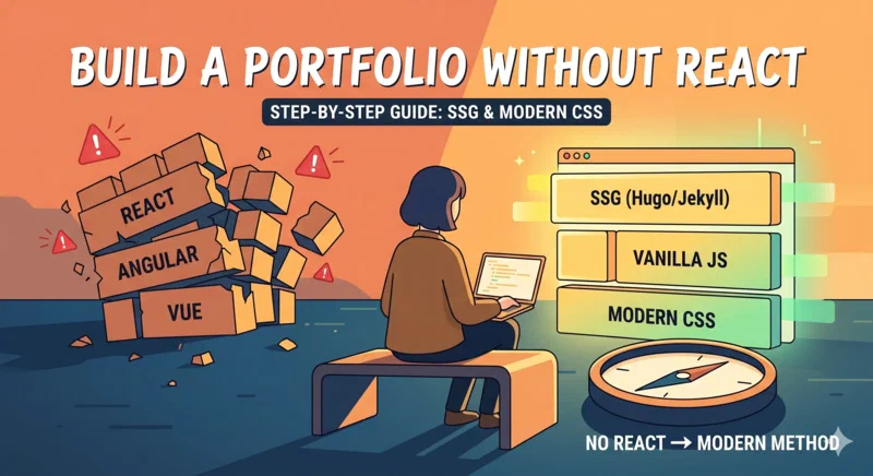
Why Skip React for Your Portfolio?
If you’re a React developer, building your portfolio with React seems like a “no-brainer.” It shows you know the framework, right? Not necessarily. In 2026, the real mark of a senior developer is the ability to choose the right tool for the job, not just the one they are most comfortable with.
Reaching for a heavy JavaScript framework for a site that is essentially 90% static text and images introduces what I call the “React Tax”:
- Bundle Bloat: You’re shipping 40KB+ of framework code before the user sees a single pixel.
- Hydration Cost: The browser has to execute JavaScript just to make your text readable.
- Maintenance: Dependencies rot. A portfolio built in React 18 will need an upgrade in two years; a portfolio built in Hugo or raw HTML will work for a decade.
Build a Portfolio Without React: A Step-by-Step Guide.
A portfolio built with static HTML and modern CSS demonstrates that you understand the web’s fundamentals: performance, accessibility, and the DOM.
Choose Your Approach: The Content-First Model
While you could write every HTML file by hand, a Static Site Generator (SSG) gives you the best of both worlds: a component-like development experience without the client-side overhead.
In this guide, we’ll use Hugo. In a previous comparison of static site generators, I’ve noted that Hugo is the gold standard for speed and developer experience in the static world.
Step 1: Initialize Your Project
First, install Hugo and scaffold your site. We’re going to build this without a pre-made theme to truly understand the architecture.
hugo new site my-portfolio
cd my-portfolio
git init
Create your basic layout structure:
mkdir -p layouts/_default layouts/partials
touch layouts/_default/baseof.html layouts/_default/list.html layouts/_default/single.html
touch layouts/index.html
Step 2: The “Base” Template
The baseof.html file is your “Master Page.” It contains the <head> and the
structure shared by every page.
<!DOCTYPE html>
<html lang="en">
  <head>
    <meta charset="UTF-8" />
    <meta name="viewport" content="width=device-width, initial-scale=1.0" />
    <title>{{ .Title }} | {{ .Site.Title }}</title>
    <link rel="stylesheet" href="/css/style.css" />
  </head>
  <body>
    {{ partial "header.html" . }}
    <main>{{ block "main" . }}{{ end }}</main>
    {{ partial "footer.html" . }}
  </body>
</html>
Step 3: Architecture for Projects
Your projects should be “First Class Citizens” in your codebase. Instead of hardcoding them into the homepage, use Hugo’s content model.
Create your projects:
hugo new projects/my-cool-app.md
hugo new projects/api-wrapper.md
In the markdown frontmatter, add custom metadata:
---
title: "The Ultimate API Wrapper"
description: "A high-performance Go library for handling rate-limited APIs."
tech_stack: ["Go", "Redis", "Docker"]
github_link: "https://github.com/valpaliy/api-wrapper"
featured: true
image: "images/projects/api-wrapper.jpg"
---
Step 4: The Project Gallery (The Hugo Logic)
Now, let’s build a component that automatically lists your featured projects on
the homepage (layouts/index.html).
{{ define "main" }}
<section class="hero">
  <h1>Hi, I'm {{ .Site.Author.name }}</h1>
  <p>I build high-performance web experiences without the fluff.</p>
</section>

<section class="projects-grid">
  {{ range where .Site.RegularPages "Section" "projects" }} {{ if
  .Params.featured }}
  <div class="project-card">
    <img src="{{ .Params.image }}" alt="{{ .Title }}" />
    <h3>{{ .Title }}</h3>
    <p>{{ .Description }}</p>
    <div class="tags">
      {{ range .Params.tech_stack }}
      <span class="tag">{{ . }}</span>
      {{ end }}
    </div>
    <a href="{{ .Permalink }}" class="btn">View Case Study</a>
  </div>
  {{ end }} {{ end }}
</section>
{{ end }}
Step 5: Modern CSS Layouts (Bento Grids and More)
Forget Bootstrap. Use CSS Grid to create a modern, responsive layout.
:root {
  --bg-color: #f9fafb;
  --text-color: #111827;
  --accent-color: #2563eb;
  --card-bg: #ffffff;
}

.projects-grid {
  display: grid;
  grid-template-columns: repeat(auto-fill, minmax(350px, 1fr));
  gap: 2rem;
  padding: 2rem 0;
}

.project-card {
  background: var(--card-bg);
  border: 1px solid #e5e7eb;
  border-radius: 12px;
  overflow: hidden;
  transition: transform 0.3s cubic-bezier(0.4, 0, 0.2, 1);
}

.project-card:hover {
  transform: translateY(-8px);
  box-shadow: 0 20px 25px -5px rgba(0, 0, 0, 0.1);
}
Pro Tip: CSS Custom Properties Use CSS Custom Properties (variables) for
theming. This makes it trivial to add a “Dark Mode” later by just swapping the
values in a :root[data-theme='dark'] block.
Step 6: Handling Interactivity without the Weight
You don’t need a 30KB framework for a mobile menu or a simple filter. Use Vanilla JavaScript.
Common Pitfall: The “Everything is a Component” Mindset Not every piece of UI needs to be a “component” with state. For a portfolio, most interactivity is just DOM manipulation.
// A simple, accessible mobile menu toggle
const toggle = document.querySelector("#menu-toggle");
const menu = document.querySelector("#main-menu");

toggle.addEventListener("click", () => {
  const isExpanded = toggle.getAttribute("aria-expanded") === "true";
  toggle.setAttribute("aria-expanded", !isExpanded);
  menu.classList.toggle("is-active");
});
If you truly need more complex state (e.g., a live-search for your blog posts), consider Petite-Vue or Alpine.js. They provide a Vue-like experience but are optimized for “sprinkling” interactivity on top of static HTML.
Step 7: Static Forms and Search
The two biggest hurdles for static sites are contact forms and search.
- Forms: Use a service like Netlify Forms, Formspree, or Basin.
You just add a
data-netlify="true"attribute to your HTML form, and Netlify handles the submission and spam filtering. - Search: For a portfolio, you usually don’t need a server-side search. Use Fuse.js or Pagefind. These tools index your site at build time and provide a lightning-fast client-side search interface.
Step 8: Image Optimization (The Hugo Superpower)
Large images are the #1 killer of portfolio performance. Hugo can automatically process your images.
{{ $image := resources.Get .Params.image }} {{ $optimized := $image.Resize "800x
webp q75" }}
<img
  src="{{ $optimized.RelPermalink }}"
  width="{{ $optimized.Width }}"
  height="{{ $optimized.Height }}"
  alt="{{ .Title }}"
/>
This single line of code ensures that no matter how big the original file was, the user only downloads a perfectly sized, compressed WebP image.
Conclusion: The Professional Edge
Building your portfolio without React is more than a technical exercise; it’s a statement. It says: “I understand how the web works. I care about my users' bandwidth. I can build fast, resilient systems.”
If you want to see a full-scale example of this philosophy in action, check out my Introducing Olivero Hugo Theme post. It’s a project that brings world-class accessibility and performance to the Hugo ecosystem without the overhead of modern JavaScript frameworks.
Your portfolio is your calling card. Make sure it loads before the hiring manager gets bored and clicks away.
Struggling with a specific Hugo layout or CSS grid issue? Drop me a line on social media—I’m always happy to help fellow “lean web” enthusiasts.