W3.CSS: The Best CSS Framework You've Never Used
In the ever-evolving landscape of frontend development, we are often swept away by the “next big thing.” From the early days of Bootstrap to the current dominance of utility-first paradigms like Tailwind, the search for the perfect CSS framework feels like an endless marathon. However, in our quest for novelty, we frequently overlook tools that have been quietly providing robust, efficient, and standard-compliant solutions for years.
One such tool is W3.CSS.
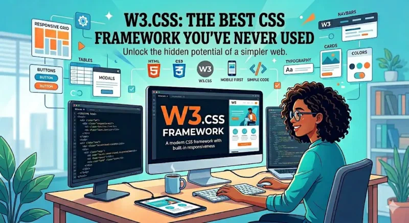
W3.CSS: The Best CSS Framework You've Never Used.
Developed by W3Schools, W3.CSS is a modern, responsive, and mobile-first CSS framework that prides itself on simplicity and performance. While it might not have the massive marketing engine of a Silicon Valley startup behind it, its technical merits make it a formidable contender for developers who value speed, accessibility, and adherence to W3C standards.
The Philosophy of Simplicity
The primary philosophy behind W3.CSS is that CSS should be easy to learn, easy to use, and, most importantly, independent of any JavaScript libraries. Unlike Bootstrap (which historically relied on jQuery) or many modern React-based component libraries, W3.CSS is pure CSS.
This “no-dependency” approach is a breath of fresh air in an era where
node_modules folders regularly exceed hundreds of megabytes. When you use
W3.CSS, you are adding a single, lightweight CSS file to your project. There are
no build steps required, no configuration files to manage, and no complex
preprocessors to set up. It works out of the box, everywhere.
Alignment with W3C Standards
One of the most compelling reasons to use W3.CSS is its strict adherence to W3C standards. In a web ecosystem that is increasingly fragmented by non-standard browser features and proprietary syntax, W3.CSS stays grounded in the core principles of the World Wide Web Consortium.
By leveraging standard CSS properties and avoiding experimental features that require vendor prefixes, W3.CSS ensures maximum compatibility across all modern browsers (Chrome, Firefox, Safari, Edge) and even provides graceful degradation for older ones. This commitment to standards isn’t just a matter of technical purity; it’s about future-proofing your applications. When you build on top of W3C-compliant foundations, your code is less likely to break when browsers update their rendering engines.
Accessibility (A11y) by Default
In modern web development, accessibility is often treated as an afterthought—something to be “fixed” with a plugin or a last-minute audit. W3.CSS flips this script by integrating accessibility into its core utility classes.
The framework provides high-contrast color palettes, clear focus states for interactive elements, and a grid system that respects document flow—a critical factor for screen readers. Furthermore, because W3.CSS encourages the use of semantic HTML elements rather than a “div soup,” it naturally leads developers toward more accessible markup patterns.
When we talk about accessibility, we are talking about ensuring that everyone, regardless of their physical or cognitive abilities, can navigate and interact with the web. W3.CSS makes this goal easier to achieve by providing the visual tools necessary to meet WCAG (Web Content Accessibility Guidelines) requirements without sacrificing design flexibility.
Performance: The 100/100 Lighthouse Goal
For projects like Valticus, where a 100/100 Lighthouse score is a non-negotiable target, every byte counts. Many modern frameworks introduce significant “Total Blocking Time” (TBT) due to the JavaScript required to handle responsive behaviors or UI components.
W3.CSS is exceptionally lightweight (approximately 23KB minified and gzipped). Because it doesn’t require a runtime library, it has zero impact on TBT. Your Largest Contentful Paint (LCP) and Cumulative Layout Shift (CLS) are also easier to optimize because the framework uses stable, predictable CSS layouts that don’t rely on post-load JavaScript calculations.
W3.CSS vs. The Utility-First Trend
It is impossible to discuss CSS frameworks in 2026 without mentioning Tailwind. While utility-first CSS has its place, it is often misused by developers who end up creating unmaintainable “HTML spaghetti” — the benefits of utility classes are lost when they are applied without a deep understanding of CSS fundamentals.
W3.CSS offers a middle ground. It provides utility classes for common tasks
(colors, padding, margins, alignment) but retains a semantic component-based
approach for complex UI elements like cards, modals, and navigation bars. This
hybrid approach allows for rapid development without the visual clutter of fifty
classes on a single <div>.
The Technical Deep Dive
Let’s look at some of the features that make W3.CSS technically interesting:
1. The Proportional Grid
The W3.CSS grid system is based on a 12-column fluid grid. What sets it apart is
its simplicity. By using classes like w3-col l6 m8 s12, you can define
responsive behavior for large, medium, and small screens in a way that is
immediately readable. It uses box-sizing: border-box to ensure that padding
and borders don’t break your layout—a simple but essential standard.
2. Built-in Color Palettes
W3.CSS comes with a variety of inspired color themes (Material Design, Flat UI,
etc.). These aren’t just random hex codes; they are carefully curated palettes
that ensure text legibility and visual harmony. The w3-text-{color} and
w3-{color} classes make it incredibly easy to maintain a consistent brand
identity across a site.
3. Mobile-First Responsiveness
Every class in W3.CSS is designed with mobile users in mind. The framework assumes a mobile-first approach, meaning your default styles are for small screens, and you progressively enhance them for larger displays. This is the gold standard for modern web design, ensuring that users on slower mobile connections get a functional experience first.
When Should You Use W3.CSS?
W3.CSS is an ideal choice for:
- Fast Prototyping: You can go from an idea to a functional, good-looking UI in minutes.
- Content-Heavy Sites: Blogs, documentation, and portfolios benefit from the framework’s focus on typography and readability.
- Performance-Critical Apps: If you are aiming for top-tier SEO and Lighthouse scores, the low overhead of W3.CSS is a massive advantage.
- Developers Who Prefer Vanilla: If you want to write “real” CSS and HTML without being abstracted away by a complex build pipeline.
Conclusion: Re-evaluating Our Tools
The tech industry is prone to “shiny object syndrome.” We often jump to the latest framework because we assume “newer” always means “better.” However, the true value of a tool lies in its ability to solve problems efficiently, sustainably, and inclusively.
W3.CSS might not be the trendy choice in 2026, but it is one of the most practical ones. By focusing on W3C standards, accessibility, and pure performance, it provides a foundation that many more popular frameworks fail to match. Whether you are building a small personal project or a large-scale enterprise application, W3.CSS deserves a second look. It might just be the best framework you’ve never used.